FAME Metagenomics workshop 2022
Data visualisation Part 2
In this section, we will work through some different plots. Files to download:
Preparation
You can do these steps yourself if you like, but we’ll be skipping to the next step in the interest of time.
Relative abundance comparisons (Rstudio)
Download the kraken.taxon.tsv file above and start up Rstudio. Set your working directory to the files location. Load the libraries and read in the file.
library(tidyr)
library(dplyr)
library(ggplot2)

data = read.csv('kraken.taxon.tsv',header=T,sep='\t')
View(data)
We can plot this directly if we want to look at the species compositions, but, there are a ton of species and any plots would have way too many points. Instead, we’ll look at a higher taxon level and filter for the most abundant taxa.
phylumCounts = data %>%
  group_by(SampleID, Phylum) %>%
  summarise(n = sum(Count))
View(phylumCounts)
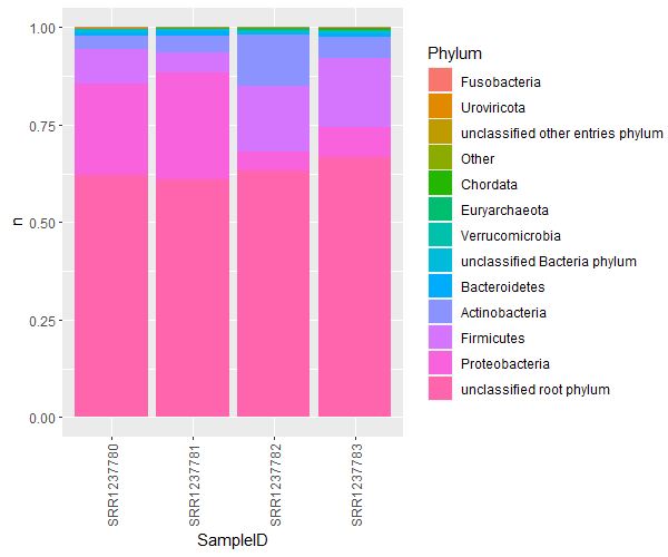
The most commonly seen visualisation for this would be a stacked bar chart of % abundances:
ggplot(phylumCounts, aes(x=SampleID, y=n, fill=Phylum)) +
  geom_bar(stat='identity',position='fill') +
  theme(axis.text.x = element_text(angle = 90, vjust = 0.5, hjust=1))
There are a bunch of very low abundance phyla that we dont care about. Let’s get a list of the most abundant phyla and lump the rest into an ‘other’ category.
topPhyla = data %>%
  group_by(Phylum) %>%
  summarise(n=sum(Count)) %>%
  filter(n>50) %>%
  pull(Phylum)

phylumOtherCounts = phylumCounts
phylumOtherCounts[!(phylumOtherCounts$Phylum %in% topPhyla),]$Phylum = 'Other'
phylumOtherCounts = phylumOtherCounts %>%
  group_by(SampleID, Phylum) %>%
  summarise(n = sum(n))
View(phylumOtherCounts)
Let’s make sure the Phyla are plotted in order of total abundance (across all samples). We have to recalculate the summaries as we now have a new ‘other’ category. Then, refactor Phylum in phylumOtherCounts:
PhylaRank = phylumOtherCounts %>%
  group_by(Phylum) %>%
  summarise(n=sum(n)) %>%
  arrange(n) %>%
  pull(Phylum)

phylumOtherCounts$Phylum = factor(phylumOtherCounts$Phylum, levels = PhylaRank)
Remake the plot:
ggplot(phylumOtherCounts, aes(x=SampleID, y=n, fill=Phylum)) +
  geom_bar(stat='identity',position='fill') +
  theme(axis.text.x = element_text(angle = 90, vjust = 0.5, hjust=1))
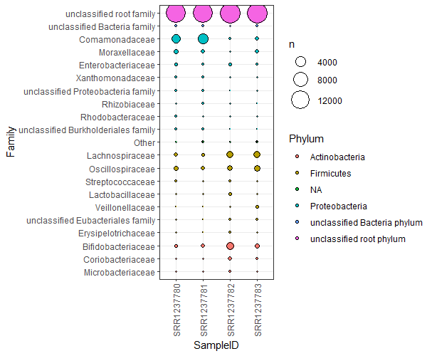
A much better version of this is a bubble plot. Bubble plots are not only clearer, but allow an extra dimension of information as well. Let’s collect the top 20ish families, and plot them coloured by their phyla, for each sample.
# grab the top 20 families
top20Fams = data %>%
  group_by(Family) %>%
  summarise(n=sum(Count)) %>%
  arrange(desc(n)) %>%
  pull(Family)
top20Fams = top20Fams[1:20]

# get the family counts per sample
FamSums = data %>%
  group_by(SampleID,Phylum,Family) %>%
  summarise(n=sum(Count))

# rename non top20 families
FamSums[!(FamSums$Family %in% top20Fams),]$Family = 'Other'
FamSums[!(FamSums$Family %in% top20Fams),]$Phylum = 'NA'

# work out the plotting order for families
FamRank = FamSums %>%
  group_by(Phylum,Family) %>%
  summarise(n=sum(n)) %>%
  arrange(Phylum, n) %>%
  pull(Family)

FamSums$Family = factor(FamSums$Family, levels=(FamRank))
To plot, we simply use geom_point(). Plot the SampleID against the Family instead of the abundance values. The abundance values are mapped to the points’ sizes. The extra dimension of information now becomes the coloring of the points. I’ve sorted and colored the points by Phylum, but you could choose some other rank, or get creating and split the data another way!
ggplot(FamSums, aes(x=SampleID,y=Family,fill=Phylum,size=n)) +
  geom_point(shape=21,color='black') +
  theme_bw() +
  theme(axis.text.x = element_text(angle = 90, vjust = 0.5, hjust=1)) +
  scale_size(range=c(0,10))
PCAs for dimension reduction (Rstudio)
For this example we’ll be using the Hecatomb tutorial output. Download bigtable.tsv.gz and metadata.tsv.gz. Load the bigtable into a dataframe in R:
library(tidyr)
library(dplyr)
install.packages('ggfortify')
library(ggfortify)

data = read.csv('bigtable.tsv.gz',header=T,sep='\t')
View(data)
This file is very similar to the Kraken.taxon.tsv file, only it has a ton of alignment metrics that are useful for filtering false positives. Let’s quickly filter our Hecatomb hits to only consider the Viral compositions with high quality alignments.
VirusesFiltered = data %>% filter(kingdom=='Viruses' & evalue < 1e-10)
We can profile how similar or dissimilar our samples are by their viral compositions. We’ll first collect the normalised counts of all genera for each sample, then convert it to a data matrix.
# create the counts
viralGeneraCounts = VirusesFiltered %>%
  group_by(sampleID, genus) %>%
  summarise(n = sum(normCount))

# wide format
ViralGeneraWide = viralGeneraCounts %>%
  spread(genus, n, fill=0)

View(ViralGeneraWide)
Calculate a PCA!
# scaled and centred - skip the first column which is our sample names
pca = prcomp(ViralGeneraWide[2:149], scale=T, center=T)
Let’s look at the summary:
summary(pca)
Importance of components:
                          PC1    PC2    PC3    PC4    PC5     PC6     PC7    PC8     PC9
Standard deviation     5.0270 4.7307 4.2255 4.2056 3.9012 3.70916 3.63554 3.3845 3.34037
Proportion of Variance 0.1708 0.1512 0.1206 0.1195 0.1028 0.09296 0.08931 0.0774 0.07539
Cumulative Proportion  0.1708 0.3220 0.4426 0.5621 0.6649 0.75790 0.84721 0.9246 1.00000
                            PC10
Standard deviation     2.108e-15
Proportion of Variance 0.000e+00
Cumulative Proportion  1.000e+00
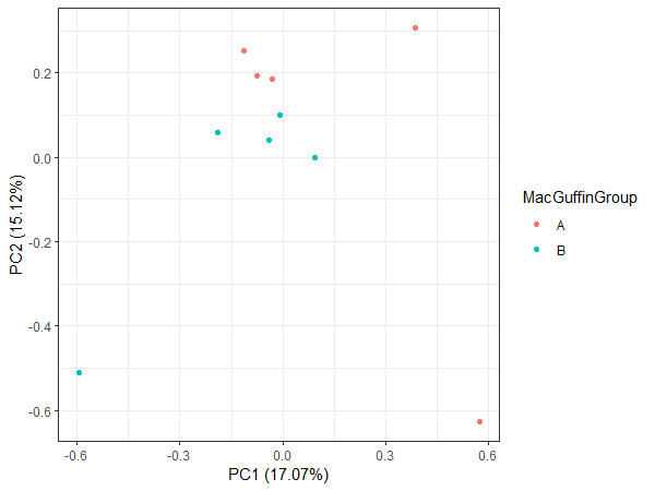
The top two principle components explain 32 % of the variance. Not too shabby. We can visualise the contributions of each PC.
plot(pca, type='l')
Ideally this plot should have an elbow shape. There are many packages for plotting PCAs themselves, I’ll use ggfortify:
autoplot(pca)
This doesn’t tell us much, we need some METADATA!
meta = read.csv('metadata.tsv.gz', header=T,sep='\t')
ViralGeneraMeta = merge(ViralGeneraWide, meta, by = 'sampleID')
Remake the plot colouring with the different metadata groups that we have.
autoplot(pca, data = ViralGeneraMeta, colour = 'MacGuffinGroup') + theme_bw()
autoplot(pca, data = ViralGeneraMeta, colour = 'vaccine') + theme_bw()
autoplot(pca, data = ViralGeneraMeta, colour = 'sex') + theme_bw()
This looks a bit more interesting.
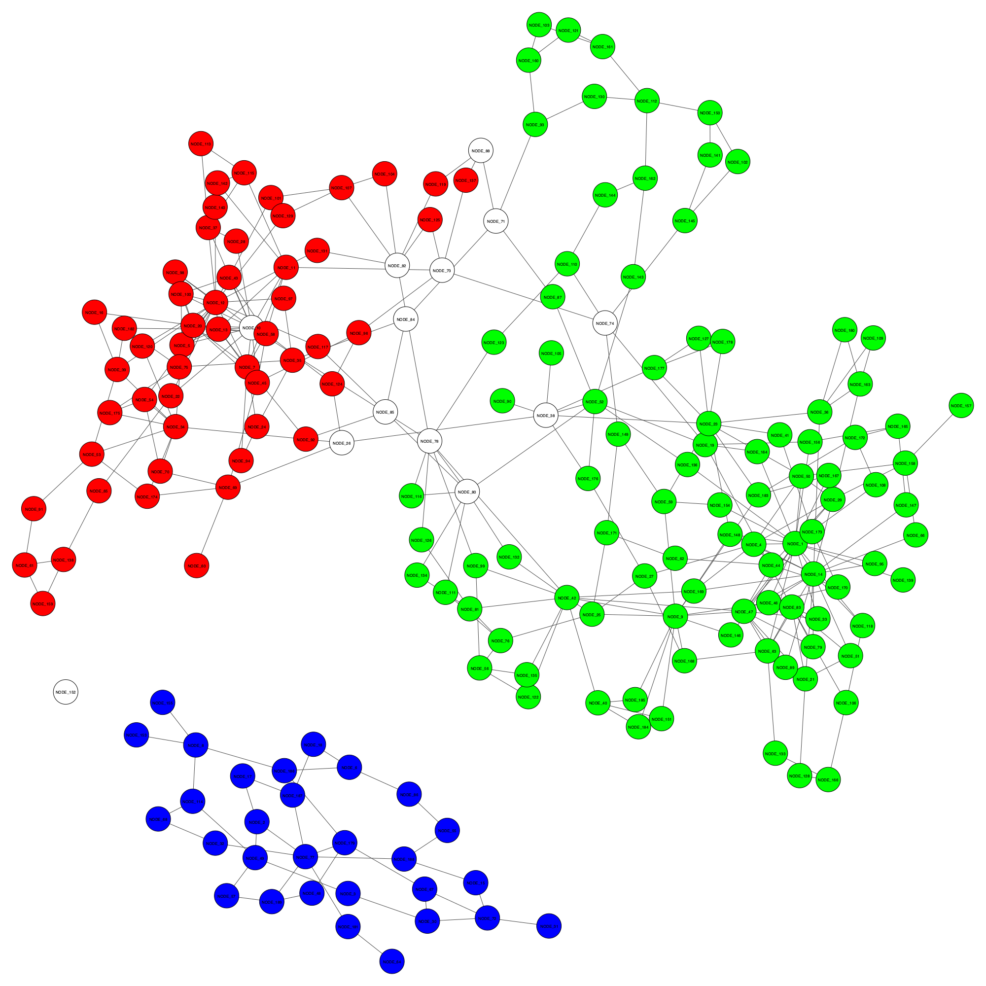
Visualising binning results on assemblies
Let’s visualise an existing binning result and the improved binning result from GraphBin for a sample dataset.
Download the files to your laptop
Go to https://cloudstor.aarnet.edu.au/plus/s/PEpz3m2DQdZq04W.
Select all the files and click on Download.
The files will download to your laptop as visualise.tar.
Transfer the files to the server provided for workshop
On your laptop, use WinSCP to transfer files.
If you are using the command line on your laptop, enter the following command and your password when prompted.
scp visualise.tar username@115.146.84.253:~/.
You should see the progress of your upload.
Confirm files were transferred to the server
Log in to the server using ssh command and enter your password when prompted.
ssh username@115.146.84.253
OR use putty or MobaXterm to login instead.
Once logged in, type the command ls. You should see visualise.tar in the list.
Decompress visualise.tar
Type in the following command to extract the files from visualise.tar.
tar -xvf visualise.tar
ls
If you type the command ls, you will see the folder visualise.
Go into the folder visualise and list the content using the following command.
cd visualise
ls
You will see the following files when you enter the ls command.
assembly_graph_with_scaffolds.gfacontigs.fastacontigs.pathsgraphbin_output.csvinitial_contig_bins.csvvisualise_result.py
Visualise the results
If you want to run the script on your laptop, make sure you have the following python packages installed.
csvpython-igraphcairocffi
Now execute the following command.
python visualise_result.py --graph assembly_graph_with_scaffolds.gfa --paths contigs.paths --initial initial_contig_bins.csv --final graphbin_output.csv --output ./
You will see two files named initial_binning_result.png and final_GraphBin_binning_result.png have been generated for the two binning results.
Now open a new command line or terminal on your laptop. Make sure you are not on the server. Let’s transfer the two images we created to your laptop using the following commands. You will have to enter your password after each command.
scp username@115.146.84.253:~/visualise/initial_binning_result.png ./
scp username@115.146.84.253:~/visualise/final_GraphBin_binning_result.png ./
Now open the files you downloaded from the file browser.
Initial binning result - initial_binning_result.png
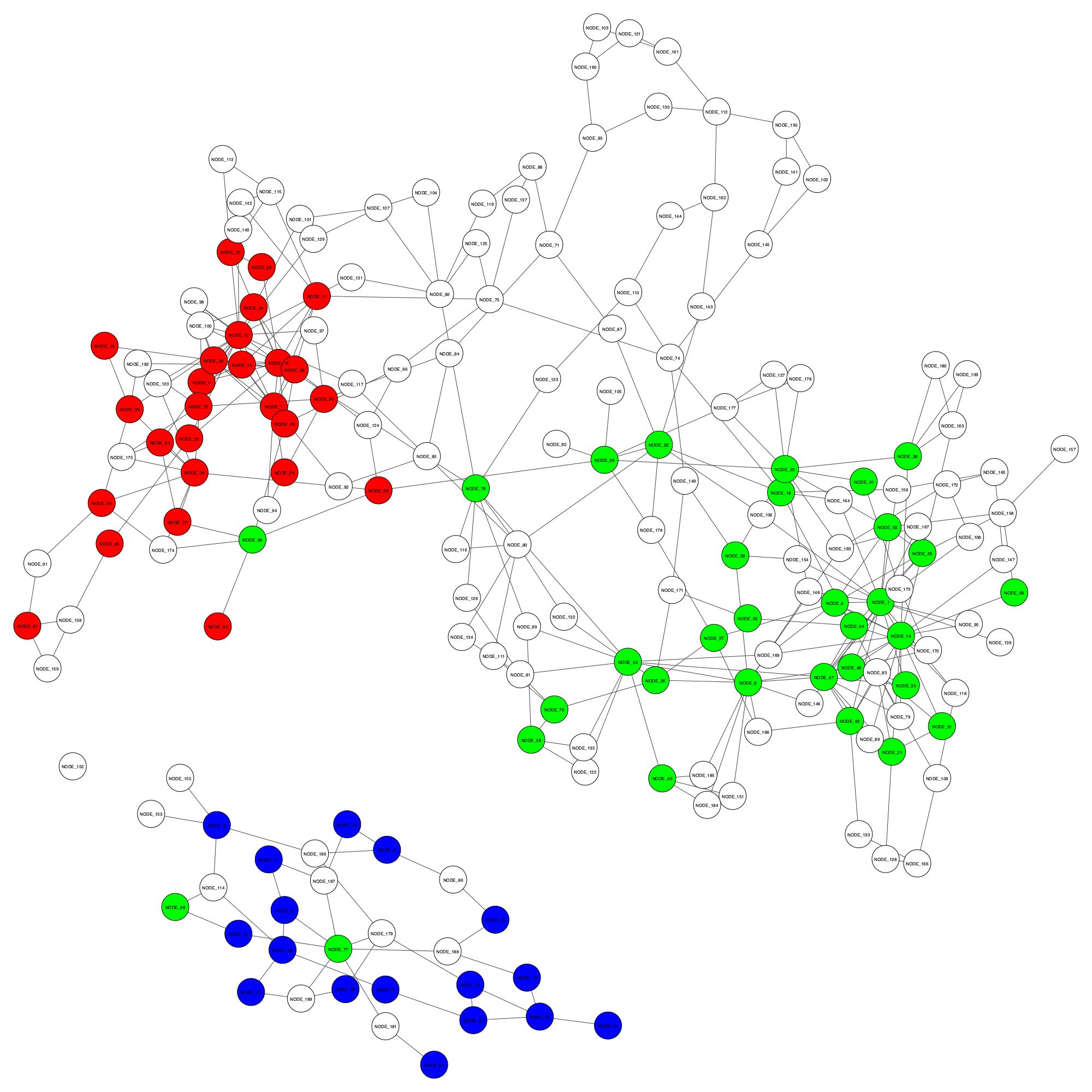
GraphBin result - final_GraphBin_binning_result.png