Just another bioinf blog
Blog by Michael Roach: @BeardyMcJohnFace@genomic.social
email: mroach@bioinf.cc
Circos part 1: Histograms
12 Jul 2020
Circos plots are a bit over-used in genomics papers and often are only there to dazzle the reader with a pretty graphic. However, they can be both useful _and_ pretty. In this part I'll cover a basic circos plot with coverage and SNP histograms, which can be helpful for things like assessing an assembly for LoH, gene conversions, redundancy, etc.Don’t feel like learning anything? That’s ok too, here’s a pipeline: https://bitbucket.org/mroachawri/snakemakecircos/
Karyogram
The easiest file to make will be the karyogram file. It contains the same basic information that’s in a SAMtools fasta index (.fai) file, so that’s what we’ll use to make it. It’s used for drawing the ideogram and for positioning your annotations. You can have the contigs all different colours, but we’ll just make them all white.
$ awk '{print "chr - "$1" "$1" 0 "$2" white"}' genome.fasta.fai > chr.kar
Coverage
If you want to plot the coverage over the genome, you’ll probably do that by calculating average coverage over genome windows. If you’ve already mapped some reads to the genome then BEDtools will be able to handle everything else.
The first thing you’ll need are the windows themselves. I usually aim for ~1000 windows total; so for a 13 Mb genome I’ll use 25 kb windows with 12 kb steps.
$ bedtools makewindows -g genome.fasta.fai -w 25000 -s 12500 > genome.windows
To calculate the window coverage, I find BEDtools multicov is an ok approximation (it counts the reads per window rather than read-depth).
$ bedtools multicov -bams aligned.bam -bed genome.windows > genome.cov.histogram
SNPs
Getting the SNP densities is also fairly straight forward. Assuming you’ve called and filtered your heterozygous SNPs we again just use BEDtools. The vcf file here is compressed with bgzip and indexed with tabix, but it’s not necessary. Finally, I like to convert the SNP densities to negative values–you’ll see why further down.
$ bedtools intersect -a genome.windows -b hetSnps.vcf.gz -c \
    | awk '{$4*=-1;print}' > genome.snps
Plotting: Ideogram
The final file we need to create is the circos configuration file.
Create a file called circos.conf and paste the following into it:
karyotype = chr.kar
chromosomes_units = 100000

<<include colors_fonts_patterns.conf>>
<<include housekeeping.conf>>

# IMAGE
<image>
<<include image.conf>>
</image>
There’s a lot to unpack in these config files; the first bit we add tells circos the karyogram file to use, what a chromosome unit is (used for spacing etc.), and calls some necessary config files (included with circos).
To display the ideogram you need to add the following block to the
circos.conf file:
# IDEOGRAM
<ideogram>
<spacing>
default = 1u
break = 1u
</spacing>
radius           = 0.9r
thickness        = 100p
fill             = yes
stroke_color     = black
stroke_thickness = 10p
show_label       = yes
label_radius     = 1.05r
label_size       = 80p
label_parallel   = yes
</ideogram>
The ‘radius’ setting specifies the ideogram’s position on the plot, from 0 to 1, where 1 is touching the edge of the plot. Subsequent plots and labels have a similar radial setting, but these specify the position of the label or plot relative to the ideogram. Yes it’s a bit dumb and confusing at first.
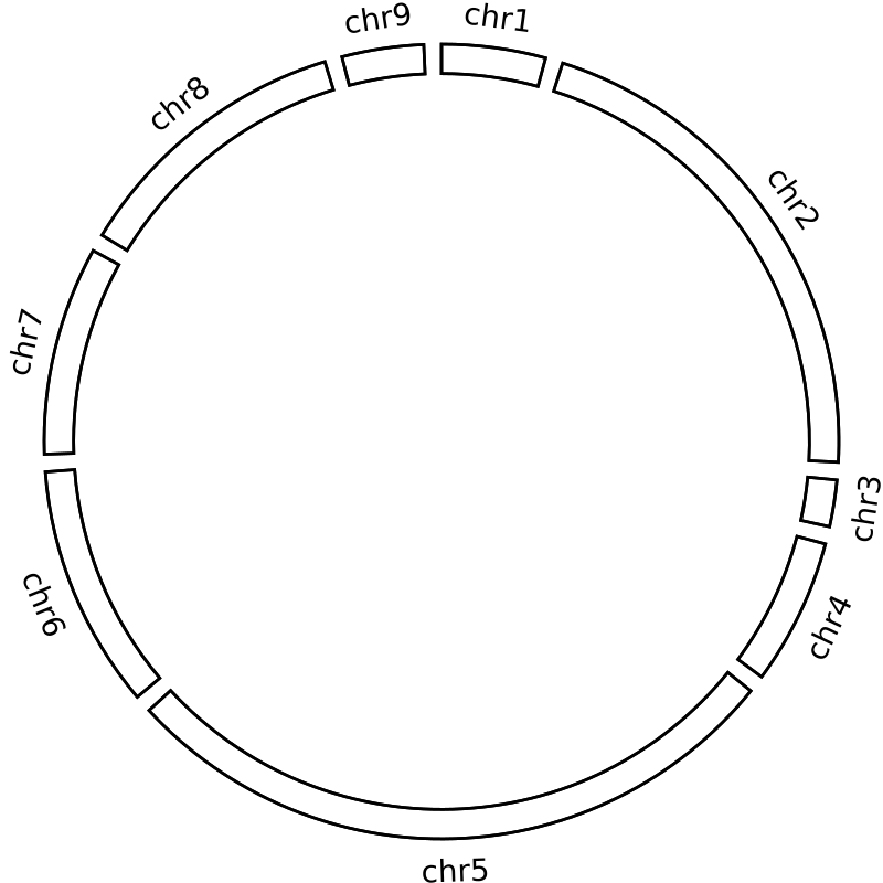
Go ahead and run circos; you should get a ‘blank’ circos plot like this:
The other settings should be fairly intuitive, play around with them and see what they do.
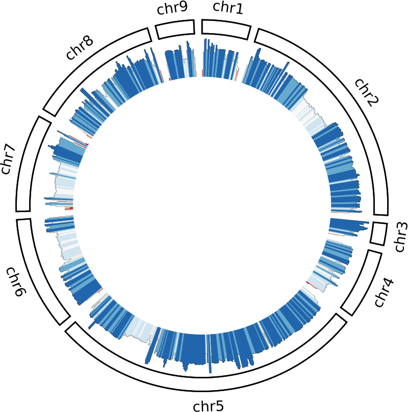
Plotting: Coverage
Next, we need to tell circos what files to plot and how/where to plot them. Circos uses white-space-separated files; the BED files we made are already compliant so we can just use them directly.
# PLOTS
<plots>
type       = histogram
color      = black
fill_under = yes
thickness  = 1
<plot>
file = genome.cov
r0   = 0.75r
r1   = 0.98r
min  = 0
max  = 25000
<rules>
<rule>
condition = 1
fill_color = eval(sprintf("rdbu-7-div-%d",remap_int(var(value),0,18000,1,7)))
</rule>
</rules>
</plot>

</plots>
The r0 and r1 are the radial settings for the plot’s position–here
the plot is positioned between 75% and 98% of the ideogram’s radius.
The max value will be specific for your dataset, so just find something
that looks good with trial and error.
I usually go for a value a bit above the median coverage so that you can
still see high coverage spikes.
Finally, we colour the histogram using a rule.
This rule maps a diverging colour gradient to each window according to
the window’s depth.
I’ve used 18000 which is about the median coverage for my dataset, but
again just find something that looks nice with trial and error.
Plotting: SNPs
Lets expand the plots block to include the SNP histogram:
# PLOTS
<plots>
type       = histogram
color      = black
fill_under = yes
thickness  = 1
<plot>
file = genome.cov
r0   = 0.75r
r1   = 0.975r
min  = 0
max  = 25000
<rules>
<rule>
condition = 1
fill_color = eval(sprintf("rdbu-7-div-%d",remap_int(var(value),0,18000,1,7)))
</rule>
</rules>
</plot>

<plot>
file = genome.snps
r0   = 0.5r
r1   = 0.725r
min  = -1800
max  = 0
<rules>
<rule>
condition = 1
fill_color = eval(sprintf("rdbu-7-div-%d",remap_int(var(value),-1800,0,7,1)))
</rule>
</rules>
</plot>

</plots>
You can see it follows a very similar pattern. We’re plotting the SNPs between 50% and 72.5% of the ideogram’s radius, and we need to adjust for converting to negative values. The only reason I do this is so that the SNPs and coverage plots are ‘back-to-back’ with the SNPs facing inwards and the coverage outwards. This is purely a personal preference as I find it easier to interpret.
Further reading
There are a few other things we could include to make the plot even prettier (let’s face it, it’s why we use it). These include things like adding ticks and tick labels to the ideogram, backgrounds and guidelines to the plots etc. but I’ve left these out for simplicity’s sake. The Circos tutorials themselves are an overwhelming volume of information, but they are a fantastic resource that covers everything you could possible want. http://circos.ca/documentation/tutorials/.
In the next part I’ll cover plotting links by making a pretty jupiter plot.