Just another bioinf blog
Blog by Michael Roach: @BeardyMcJohnFace@genomic.social
email: mroach@bioinf.cc
Inkscape: Hiding your Excel shame
29 Nov 2020
We've all been there; you just want to quickly plot some data to see if an experiment worked. You look over your shoulder to check that the coast is clear and fire up Excel. No self respecting computer scientist would actually use an Excel graph would they? Assuming you're happy with the data and want something presentable, do you repeat the process in GraphPad? Punch out a wall of R code? Or, do you just tweak it in a vector graphic application to make it look nice?I’ve been using Inkscape for a couple of years to finish figures for publications and presentations. I’ve also used it for producing infographics, and even in place of Adobe InDesign for laying out flyers and posters. While there are plenty of vector graphic applications (Adobe Illustrator is the industry standard) Inkscape is free, popular, runs on Windows, Mac, and Linux, and is your best friend for hiding your Excel shame. There are already plenty of tutorials on using Inkscape, so this post is more of a showcase for why you should consider using vector graphics.
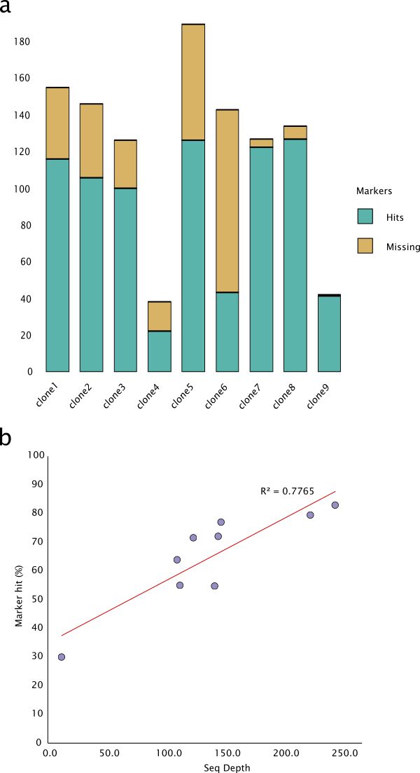
Take the graph below as an example. I’ve plot the hit and missing markers for some grapevine clones into a stacked column graph. I’ve decided that it looks good and want to use it in an article.
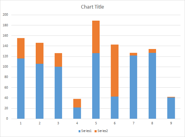
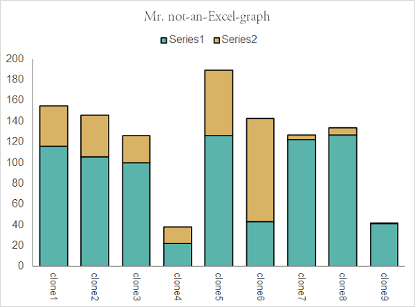
Excel itself does have a powerful functionality for customizing graphs and most elements in the graph can be tweaked. You can do lots, but you can’t do everything. Below I’ve made some changes in Excel which might be enough to fool some people.
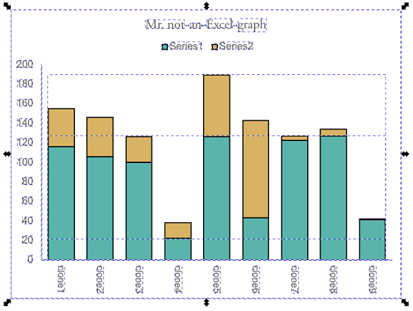
Already it does look better but we can go further. If you’re using the Desktop version of Excel, select the graph and just copy (Ctrl+c) and paste (Ctrl+v) it into Inkscape. Otherwise, export a PDF and import it into Inkscape. Select the graph in Inkscape and hit object -> ungroup. You now have unfettered access to all the vector elements making up the graph.
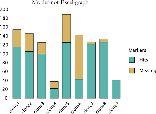
You can delete the border if you wish, and the background is not needed. I don’t like Excel’s legends; I want to change the box sizes, add a title, and am having second thoughts about its placement. I’d like to change the x-axis labels to 45 degree for better readability, and strip the axis borders for a cleaner look. Stripping content is easier than adding content so make sure to add everything you think you’ll want in the original graph in Excel, ggplot etc. before importing into Inkscape. Want to convert all the Arial text to Lucida Sans? That only takes about four seconds. Found a nice colour palette you want to use? Copy paste hex codes when adjusting fill, stroke, and gradients. There is a lot you can do with just the basic tools in Inkscape.
The tools I use the most for finishing figures are Fill and Stroke, Transform for rotations and scaling, Group and Ungroup together with Align and Distribute to help with the layout, and Text and Font. Inkscape is also perfect for creating composite figures.
Ready to publish? Export a high resolution PNG and covert to TIFF (e.g. in Gimp). Save the vector graphic as well (SVG file for Inkscape). If you need to go back and fix something (e.g. font is too small, spelling mistake, adjust colour palette, et.) you don’t need to remake the figure, you can just go back to your vector graphic file, tweak, and export the new figure. Need to render your 5 x 5 cm graph at 10,000 DPI for some reason? No worries, everything is a vector and it will still look nice and sharp. Vector graphics can help you save time and produce better figures.